Ray The Designer
Portfolio Showcase

Family Wealth Management Group

Brand Identity Design Portfolio: Family Wealth Management Group
An inclusive visual identity designed to reflect family values, diversity, and financial empowerment.
Industry:
Financial Services
Approved on:
August  2024
Contribution:
Brand Identity Design

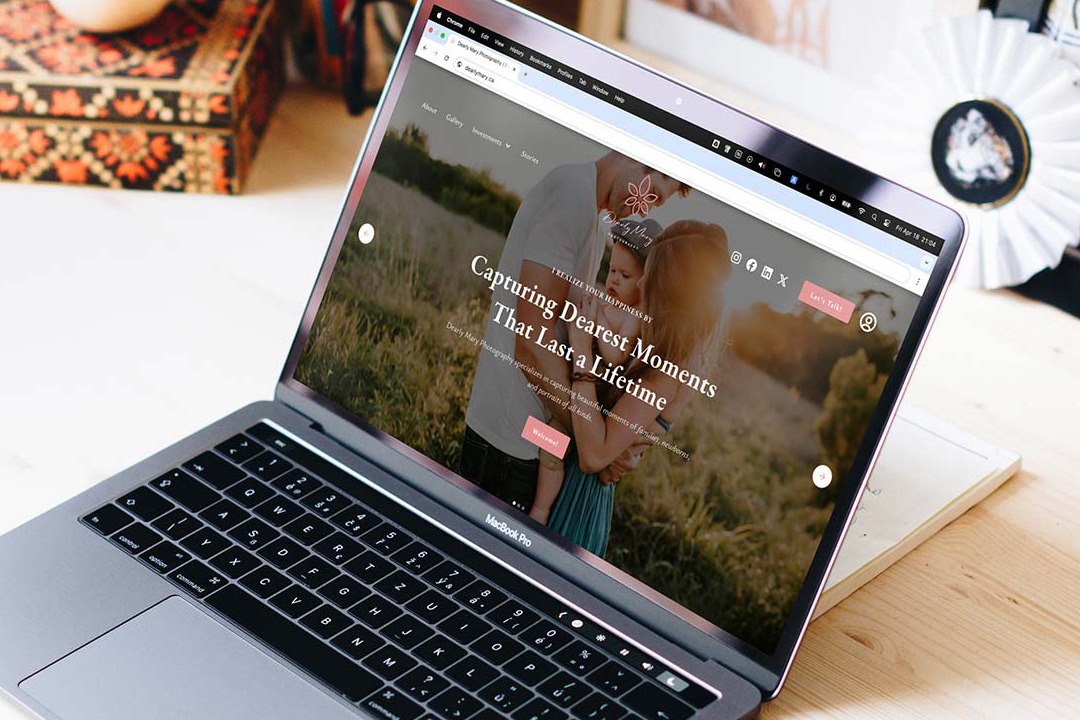
Dearly Mary Photography

Crafted a cohesive brand identity and custom Webflow website for a lifestyle photographer, showcasing her authentic, storytelling photography style and helping her connect with her ideal clients.
Branding
Website Design
Low-Code Development
Membership on Website

Industry

Photography

Release Date

April 2025

Contribution

Branding, Website Design, Low-Code Development, Membership on Website

Website

dearlymary.ca

Dearly Mary Photography

Crafted a cohesive brand identity and custom Webflow website for a lifestyle photographer, showcasing her authentic, storytelling photography style and helping her connect with her ideal clients.
Industry:
Photography
Release Date:
July 2025
Website:
dearlymary.ca

Project Overview

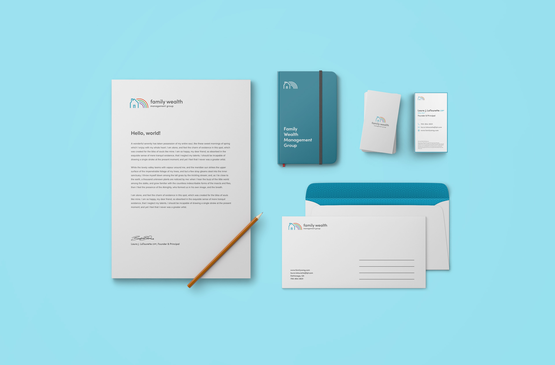
Family Wealth Management Group needed a brand identity that felt welcoming, modern, and inclusive—while maintaining the professionalism expected in the financial sector. The challenge was to create a logo that could resonate with a broad client base, including women, families, and LGBTQ+ individuals, without compromising on clarity or credibility.

Concept & Design Direction

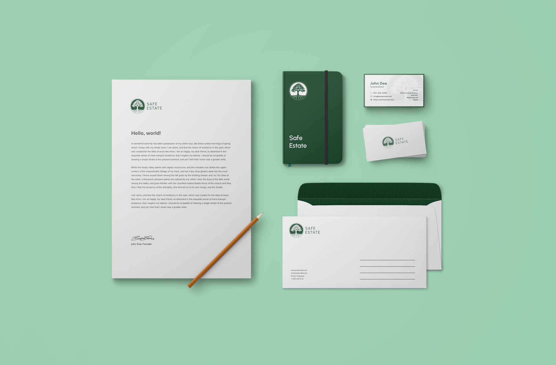
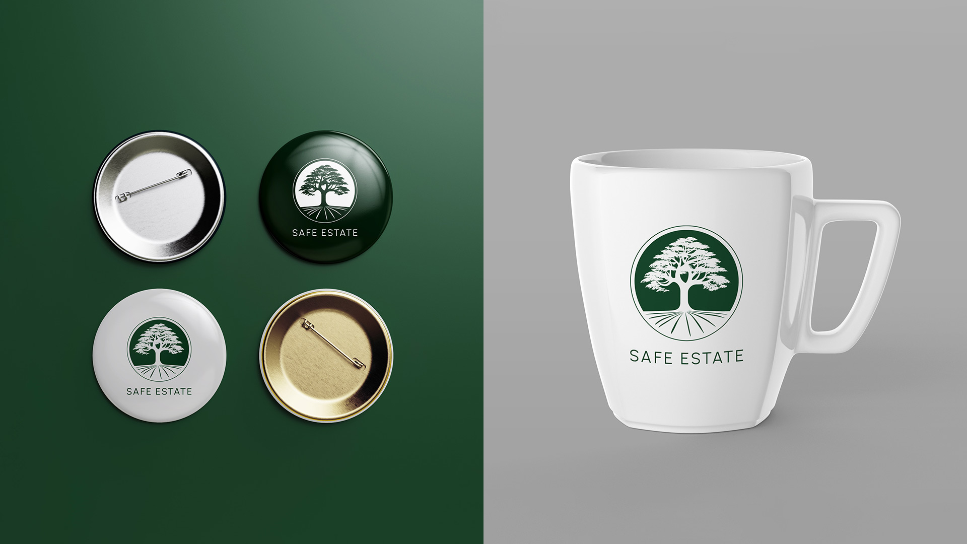
The logo centres on a majestic tree, symbolizing Safe Estate’s three decades of stable growth and legacy building. The visual language draws from nature and heritage, expressing financial maturity while keeping the tone accessible and confident.

The Urbanist typeface was selected to complement the organic form of the tree with modern clarity and professionalism. A deep green palette was chosen to evoke prosperity and trust — qualities that resonate with the target clientele.

Concept & Design Direction

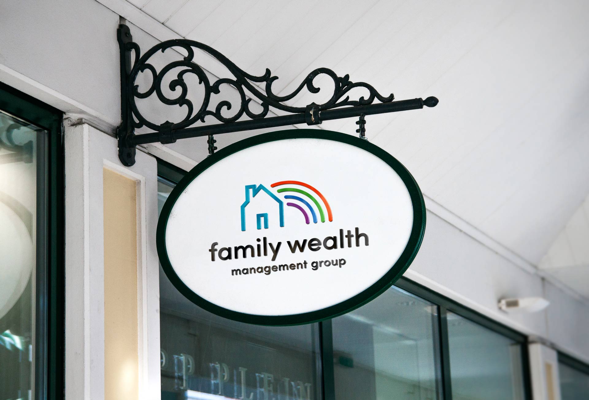
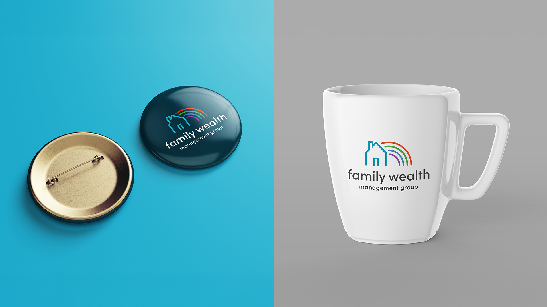
The logo features a house and rainbow mark that visually expresses the brand’s foundational values: inclusion, trust, and financial stability. The house conveys structure and support, while the rainbow arcs introduce warmth, belonging, and representation. Together, they symbolize a safe and supportive environment for wealth-building.

The wordmark uses all-lowercase Sofia Pro, a geometric sans-serif typeface that balances professionalism with friendliness. The font’s rounded forms echo the rainbow’s softness, while maintaining clear legibility and polish.

Concept & Design Direction

The logo centres on a majestic tree, symbolizing Safe Estate’s three decades of stable growth and legacy building. The visual language draws from nature and heritage, expressing financial maturity while keeping the tone accessible and confident.

The Urbanist typeface was selected to complement the organic form of the tree with modern clarity and professionalism. A deep green palette was chosen to evoke prosperity and trust — qualities that resonate with the target clientele.

Concept & Design Direction

The logo centers on a majestic tree, symbolizing Safe Estate’s three decades of stable growth and legacy building. The visual language draws from nature and heritage, expressing financial maturity while keeping the tone accessible and confident.

The Urbanist typeface was selected to complement the organic form of the tree with modern clarity and professionalism. A deep green palette was chosen to evoke prosperity and trust —qualities that resonate with the target clientele.

Primary Logo Lockup

This is the main vertical logo used across most brand touchpoints, offering strong visual recognition and a balanced blend of structure and approachability.

Alternative Logo Lockup

A horizontal lockup ideal for applications with limited vertical space, retaining the full mark and wordmark in a more compact orientation.

Logo on Grayscale

Designed for versatility, the logo remains legible and identifiable in monochrome applications. Its contrast ensures clarity whether printed in black-and-white or displayed on colour-limited platforms.

Primary Colour Palette

This palette supports professionalism with a modern twist. Teal tones express calm authority and accessibility, while neutral blacks and whites ground the identity.

Family Wealth Management Group – Primary Colour Palette
Family Wealth Management Group – Secondary Colour Palette

Secondary Colour Palette

These vibrant accents are used in the rainbow symbol, adding diversity, energy, and vibrance to the brand’s visual expression while reinforcing its inclusive values.

Typography

Sofia Pro’s geometric yet friendly form makes it ideal for a brand centred on both professionalism and warmth. Used across all text styles, it ensures consistency while remaining legible and visually welcoming.

Family Wealth Management Group – Typography
Family Wealth Management Group – Final Thoughts

Final Thoughts

This identity system supports Family Wealth Management Group’s mission to offer inclusive, client-first financial services. The visual language blends strength with warmth — ensuring the brand speaks clearly to both the mind and the heart.
Get in Touch and Let’s Collaborate

Feel free to send me a message on LinkedIn using the link below — I’d love to hear from you.

“Ray built my brand from the ground up and brought it to life through a beautifully designed, fully functional website. His attention to detail and creativity are unmatched.”
Mary Ann Pre-Lecitona