Safe Estate, LLC


Project Overview
Safe Estate, LLC is a financial services company that specializes in asset preservation and legacy planning. They needed a logo that communicated trust, stability, and generational wealth. Working closely with their brand philosophy — summed up by the phrase “Zero is Our Hero!” — the goal was to create a mark that felt grounded yet forward-looking.
Concept & Design Direction
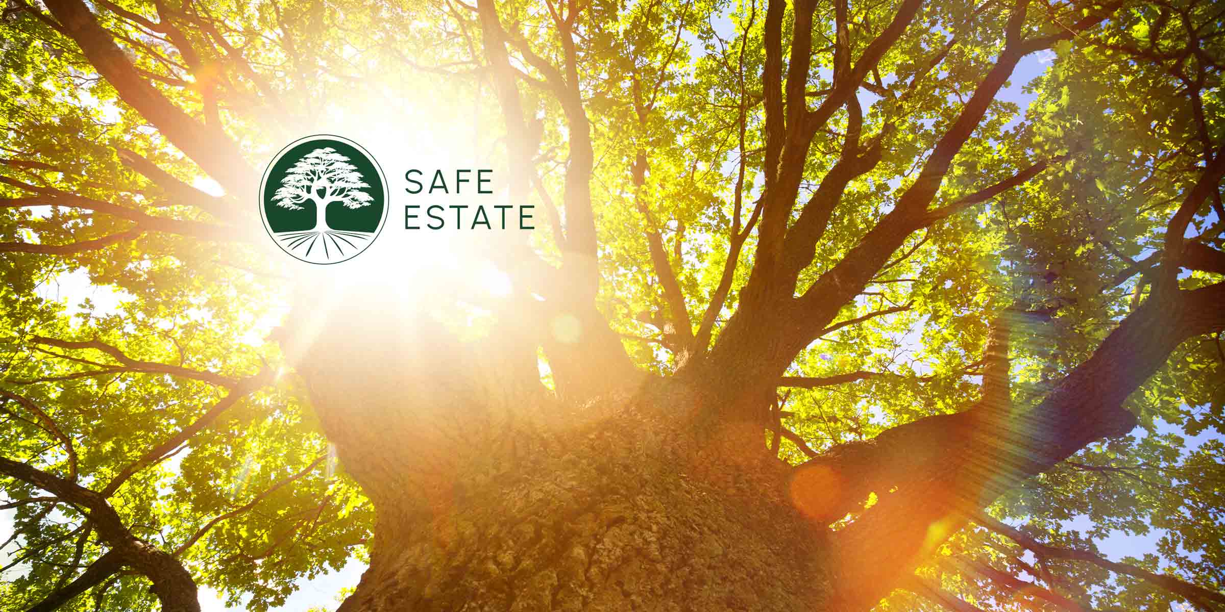
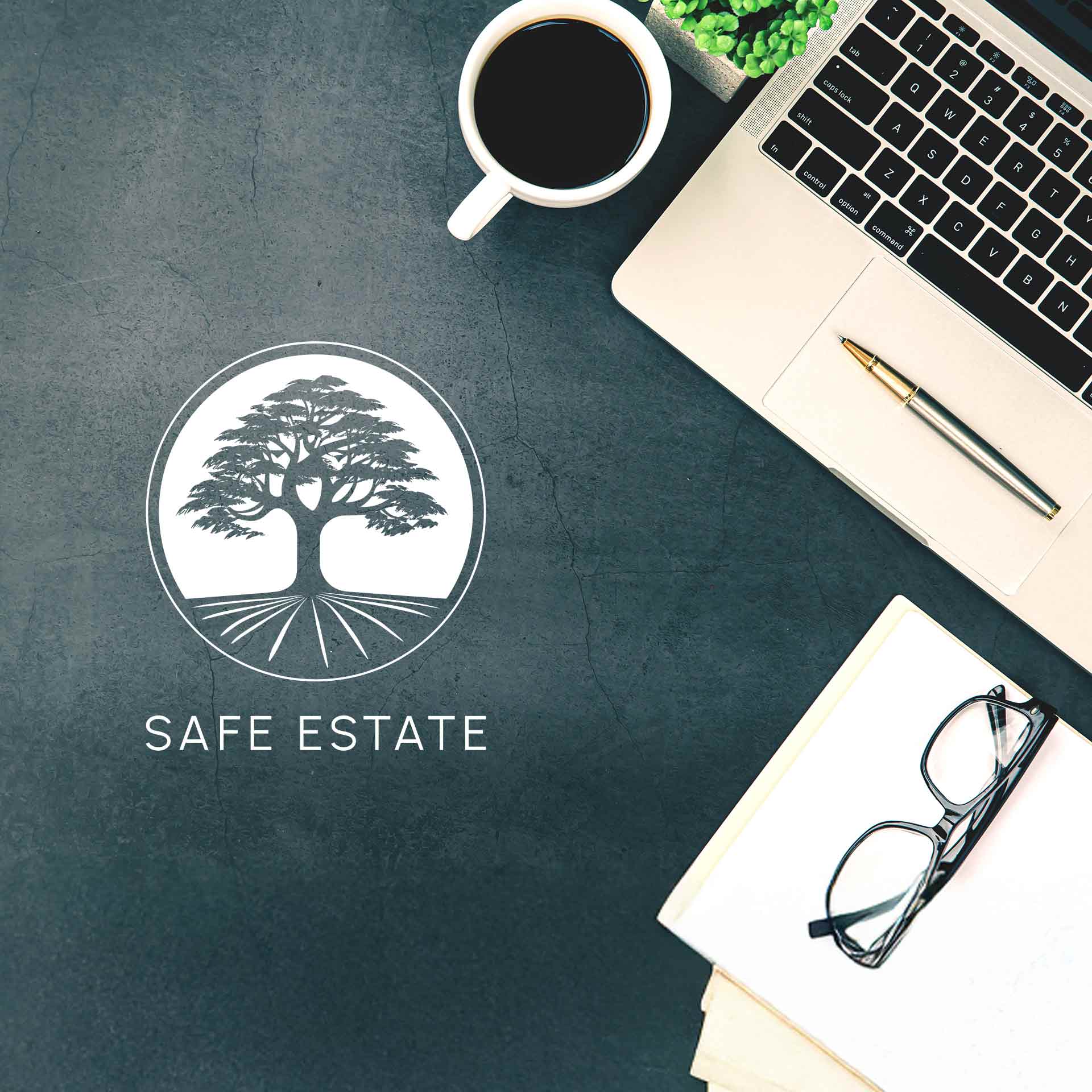
The logo centres on a majestic tree, symbolizing Safe Estate’s three decades of stable growth and legacy building. The visual language draws from nature and heritage, expressing financial maturity while keeping the tone accessible and confident.
The Urbanist typeface was selected to complement the organic form of the tree with modern clarity and professionalism. A deep green palette was chosen to evoke prosperity and trust — qualities that resonate with the target clientele.

Primary Logo Lockup
The vertical logo pairs the tree symbol with the wordmark to emphasize legacy, stability, and prosperity. It’s used across primary brand applications for strong visual impact.
Alternative Logo Lockup
This horizontal version offers a flexible solution for tighter spaces while maintaining brand clarity and cohesion across platforms.

Colour Palette
This palette was chosen for its association with growth, wealth, and clarity — key values of the Safe Estate brand.
Typography
This typographic pairing balances formality and modernity, supporting readability across both print and digital media.

Logo Applications
Final Thoughts
This project was about more than aesthetics — it was about embodying a business philosophy built on stability, trust, and generational prosperity. The final identity system gives Safe Estate a timeless foundation to grow from.
Featured Portfolio
Discover thoughtfully crafted work, each designed to elevate its brand to its fullest potential.