Ray The Designer
Portfolio Showcase

Kennedy Retirement Solutions Inc.

Brand Identity Design Portfolio: Kennedy Retirement Solutions Inc.
A confident and approachable identity inspired by flight planning, designed to guide clients toward their financial destinations.
Industry:
Financial Services
Approved on:
July  2021
Contribution:
Brand Identity Design

Dearly Mary Photography

Crafted a cohesive brand identity and custom Webflow website for a lifestyle photographer, showcasing her authentic, storytelling photography style and helping her connect with her ideal clients.
Branding
Website Design
Low-Code Development
Membership on Website

Industry

Photography

Release Date

April 2025

Contribution

Branding, Website Design, Low-Code Development, Membership on Website

Website

dearlymary.ca

Dearly Mary Photography

Crafted a cohesive brand identity and custom Webflow website for a lifestyle photographer, showcasing her authentic, storytelling photography style and helping her connect with her ideal clients.
Industry:
Photography
Release Date:
July 2025
Website:
dearlymary.ca

Project Overview

Kennedy Retirement Solutions Inc. supports individuals on their journey to retirement — using financial planning as a way to chart a course and stay aligned with long-term goals. The brand needed a logo system that reflects both professionalism and personality, blending a sense of trust with a modern, optimistic tone.

Concept & Design Direction

The logo centres on a majestic tree, symbolizing Safe Estate’s three decades of stable growth and legacy building. The visual language draws from nature and heritage, expressing financial maturity while keeping the tone accessible and confident.

The Urbanist typeface was selected to complement the organic form of the tree with modern clarity and professionalism. A deep green palette was chosen to evoke prosperity and trust — qualities that resonate with the target clientele.

Concept & Design Direction

At the heart of the logomark is a stylized “K” combined with the shape of an airplane — subtly evoking structure, forward motion, and stability. Influenced by the founder’s background as a pilot, the design draws inspiration from the metaphor of flight planning: mapping a clear path through turbulence toward a defined destination. The interlocking shapes reflect guidance and partnership throughout that journey.

The wordmark pairs Baskerville and Josefin Sans to reflect both tradition and clarity. Baskerville adds a refined, trustworthy presence to the firm’s name, while Josefin Sans introduces a clean, contemporary tone—together creating a visual voice that feels both established and approachable.

Concept & Design Direction

The logo centres on a majestic tree, symbolizing Safe Estate’s three decades of stable growth and legacy building. The visual language draws from nature and heritage, expressing financial maturity while keeping the tone accessible and confident.

The Urbanist typeface was selected to complement the organic form of the tree with modern clarity and professionalism. A deep green palette was chosen to evoke prosperity and trust — qualities that resonate with the target clientele.

Concept & Design Direction

The logo centers on a majestic tree, symbolizing Safe Estate’s three decades of stable growth and legacy building. The visual language draws from nature and heritage, expressing financial maturity while keeping the tone accessible and confident.

The Urbanist typeface was selected to complement the organic form of the tree with modern clarity and professionalism. A deep green palette was chosen to evoke prosperity and trust —qualities that resonate with the target clientele.

Primary Logo Lockup

The primary logo places the K-symbol above the stacked name, creating a formal, balanced composition for print materials, signage, and brand-first touchpoints.

Alternative Logo Lockup

This horizontal version offers versatility for applications where vertical space is limited — such as website headers or digital footers — while maintaining clear hierarchy and brand integrity.

Kennedy Retirement Solutions – Colour Palette

Colour Palette

The deep blue conveys professionalism and direction, while the green brings in a sense of optimism and steady growth. Together with black and white, the palette reflects a brand that is focused, trustworthy, and approachable — serious about outcomes yet grounded in clarity.

Typography

Baskerville brings a sense of tradition and trust to the brand, while Josefin Sans adds a clean, modern contrast. Together, they balance professionalism with approachability across all brand touchpoints.

Kennedy Retirement Solutions – Typography
Kennedy Retirement Solutions – Final Thoughts

Final Thoughts

The visual identity for Kennedy Retirement Solutions Inc. reflects the firm’s unique personality — professional, steady, and purpose-driven, with a human touch. Inspired by flight planning and long-term vision, this system equips the brand to help clients navigate confidently toward their financial goals.
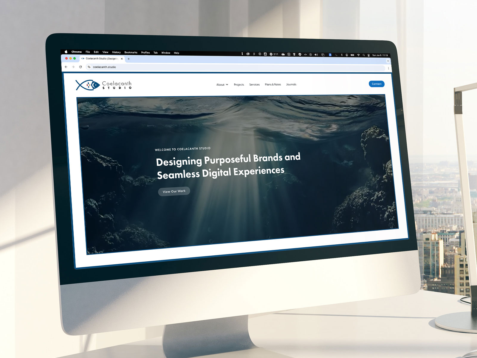
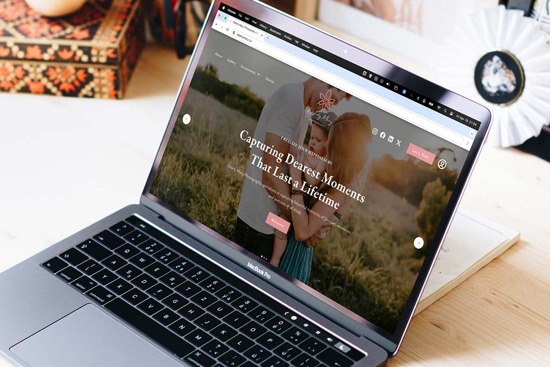
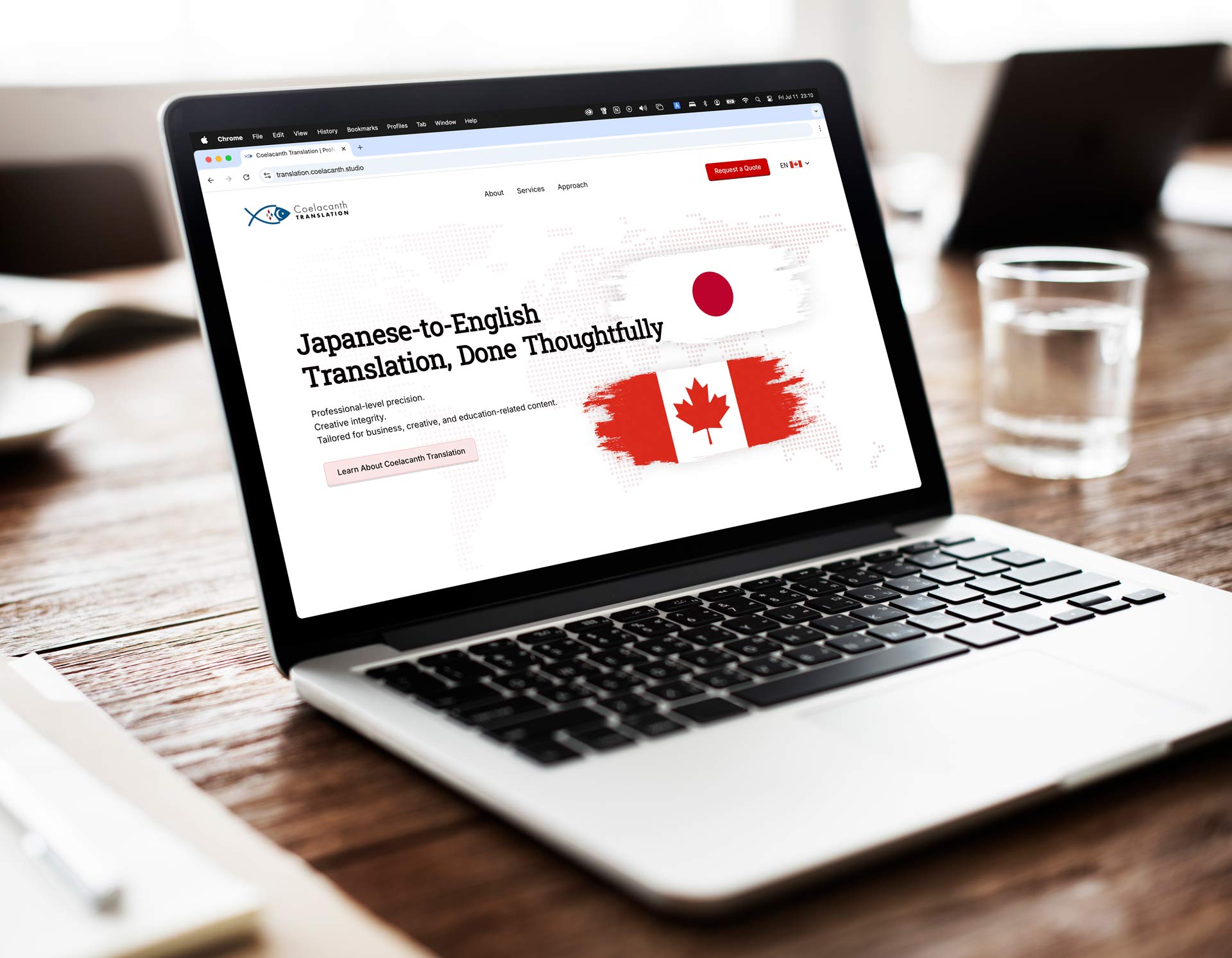
Get in Touch and Let’s Collaborate

Feel free to send me a message on LinkedIn using the link below — I’d love to hear from you.

“Ray built my brand from the ground up and brought it to life through a beautifully designed, fully functional website. His attention to detail and creativity are unmatched.”
Mary Ann Pre-Lecitona