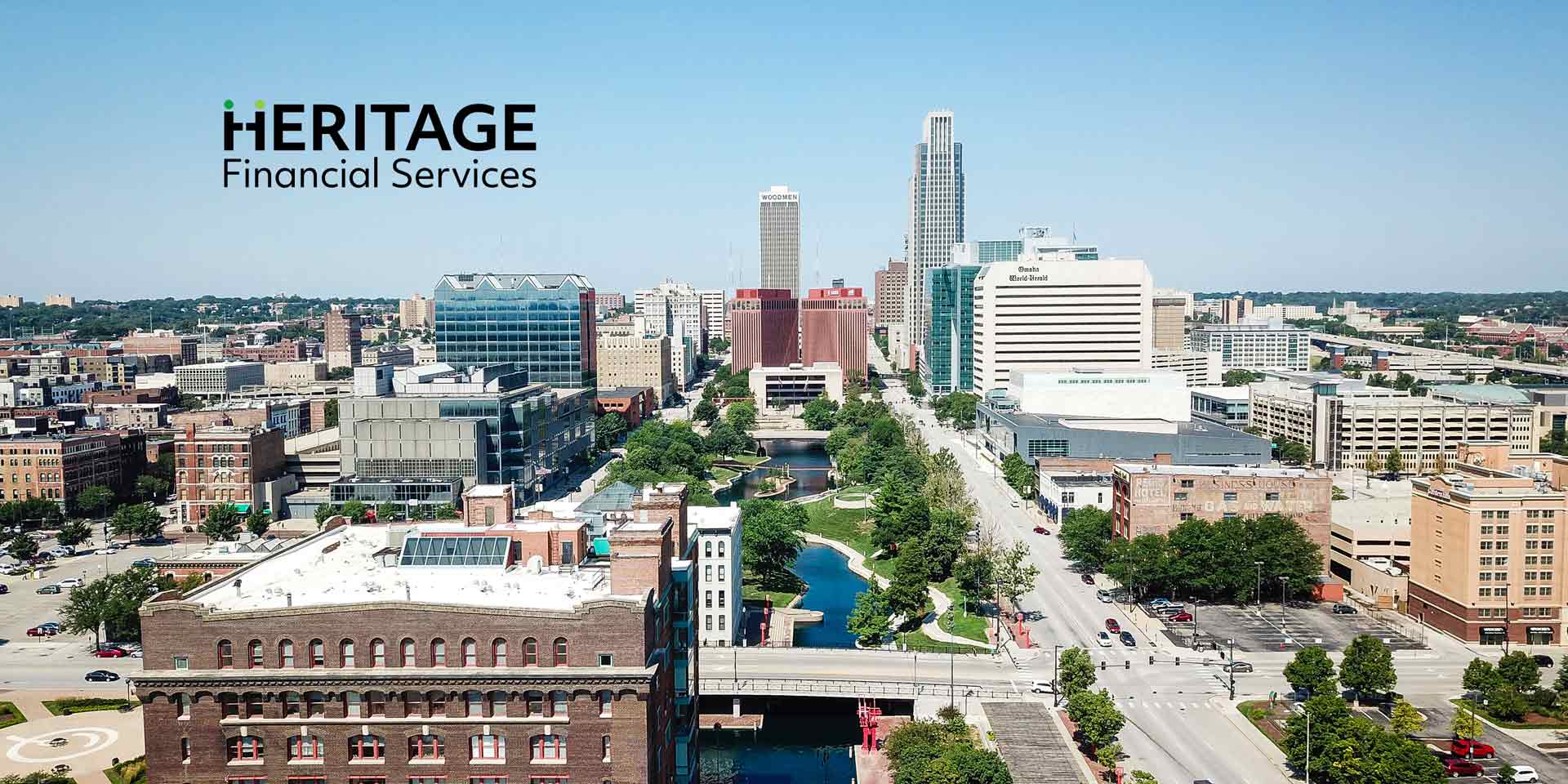
Heritage Financial Services, LLC


Project Overview
Heritage Financial Services needed a logo that conveyed both credibility and approachability. With a long-standing presence in the industry, their focus on personalized financial guidance inspired a brand identity that felt intelligent, modern, and client-first. The goal was to reflect their experienced yet innovative approach with a timeless visual mark.
Concept & Design Direction

The logo concept places human connection at its core. The stylized “H” represents the advisor-client relationship — two sides connected through thoughtful interaction. The design language blends modern professionalism with warmth and clarity, appealing to both traditional and progressive clients. Supporting brand attributes include trust, simplicity, intelligence, and contemporary sophistication.

Primary Logo Lockup
The primary logo features the full Heritage Financial Services name. It is intended for formal brand uses across digital and print materials, ensuring legibility and brand recognition.
Alternative Logo Lockup
The acronym lockup offers a flexible solution for smaller applications or social branding, maintaining consistency while optimizing for space and clarity.

Colour Palette
These colours balance freshness and professionalism. The greens express growth, vitality, and trust, while the black grounds the palette with authority.
Typography
Objektiv Mk1 delivers a contemporary, professional tone that aligns with HFS’s identity as both innovative and credible. Its clean geometry adds polish without formality. Paired with Open Sans — a neutral, highly legible body font — the system supports clarity and warmth across brand touchpoints.

Logo Applications

Final Thoughts
This brand identity captures the dual nature of Heritage Financial Services: client-focused and forward-thinking, rooted in experience yet modern in execution. The final mark is distinctive, meaningful, and adaptable — ready to grow with the company’s evolving future.
Featured Portfolio
Discover thoughtfully crafted work, each designed to elevate its brand to its fullest potential.