Ray The Designer
Portfolio Showcase

j.o.y. wealth partners

Brand Identity Design Portfolio: j.o.y. wealth partners
A gentle, sustainability-minded brand identity designed for a firm that blends wealth planning with purpose.
Industry:
Financial Services
Approved on:
December  2022
Contribution:
Brand Identity Design

Dearly Mary Photography

Crafted a cohesive brand identity and custom Webflow website for a lifestyle photographer, showcasing her authentic, storytelling photography style and helping her connect with her ideal clients.
Branding
Website Design
Low-Code Development
Membership on Website

Industry

Photography

Release Date

April 2025

Contribution

Branding, Website Design, Low-Code Development, Membership on Website

Website

dearlymary.ca

Dearly Mary Photography

Crafted a cohesive brand identity and custom Webflow website for a lifestyle photographer, showcasing her authentic, storytelling photography style and helping her connect with her ideal clients.
Industry:
Photography
Release Date:
July 2025
Website:
dearlymary.ca

Project Overview

As a financial planning firm rooted in ESG and impact investing, j.o.y. wealth partners needed a brand identity that felt intentional, inclusive, and values-driven. The design had to reflect a balance of professionalism and care — welcoming individuals who seek not only financial growth but personal fulfillment. This project focused on visually expressing that mission through warmth, clarity, and sustainability-conscious design.

Concept & Design Direction

The logo centres on a majestic tree, symbolizing Safe Estate’s three decades of stable growth and legacy building. The visual language draws from nature and heritage, expressing financial maturity while keeping the tone accessible and confident.

The Urbanist typeface was selected to complement the organic form of the tree with modern clarity and professionalism. A deep green palette was chosen to evoke prosperity and trust — qualities that resonate with the target clientele.

Concept & Design Direction

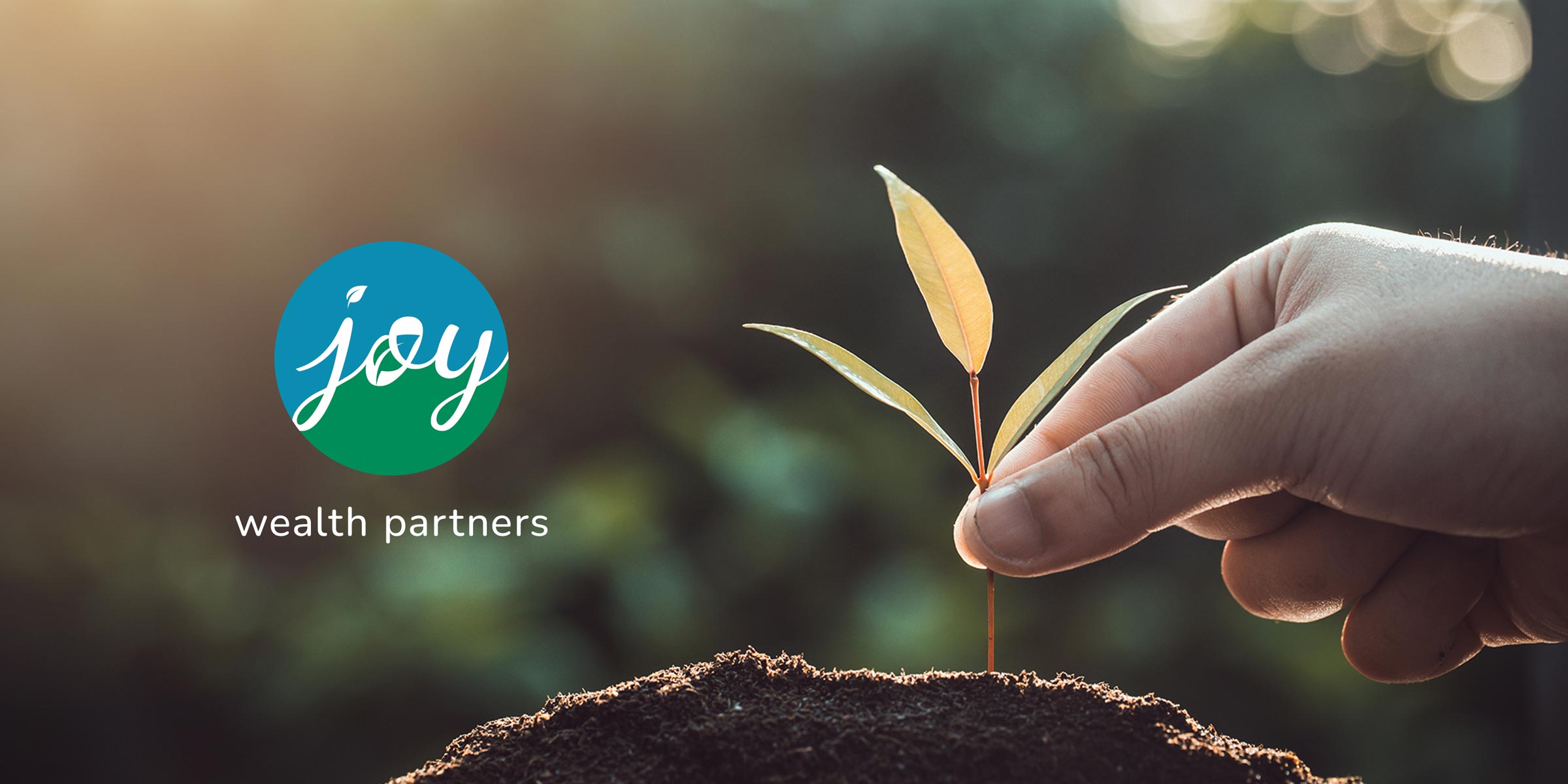
The logotype centres on the word “joy,” with its soft curves and integrated leaf shapes symbolizing growth, mindfulness, and environmental care. The rounded forms convey safety and optimism — reinforcing the firm’s values of sustainability, equity, and holistic planning.

The logo uses two typefaces: a custom script inspired by Dancing Script for the word “joy,” paired with Nunito, a clean and friendly sans-serif, for “wealth partners.” The combination creates a sense of warmth and professionalism, grounded in clarity and accessibility.

Concept & Design Direction

The logo centres on a majestic tree, symbolizing Safe Estate’s three decades of stable growth and legacy building. The visual language draws from nature and heritage, expressing financial maturity while keeping the tone accessible and confident.

The Urbanist typeface was selected to complement the organic form of the tree with modern clarity and professionalism. A deep green palette was chosen to evoke prosperity and trust — qualities that resonate with the target clientele.

Concept & Design Direction

The logo centers on a majestic tree, symbolizing Safe Estate’s three decades of stable growth and legacy building. The visual language draws from nature and heritage, expressing financial maturity while keeping the tone accessible and confident.

The Urbanist typeface was selected to complement the organic form of the tree with modern clarity and professionalism. A deep green palette was chosen to evoke prosperity and trust —qualities that resonate with the target clientele.

Primary Logo Lockup

This version is used across all brand applications, with the scripted “joy” acting as the focal point and emotional anchor of the identity.

Logo on Grayscale

The logo maintains its legibility and character in monochrome formats. The transparency in the “joy” mark allows background color or texture to show through, adding flexibility without losing brand recognition.

j.o.y. wealth partners – Colour Palette

Colour Palette

These colours were chosen to evoke freshness, trust, and sustainability. Joy Blue communicates calm intelligence, while Joy Green adds a grounded, eco-conscious touch that aligns with the firm’s ESG ethos.

Typography

Nunito and Nunito Sans work together to establish a clean, welcoming voice across all communication. Rounded terminals, generous spacing, and soft geometry reflect the firm’s balance of professionalism and warmth — ensuring both clarity and comfort.
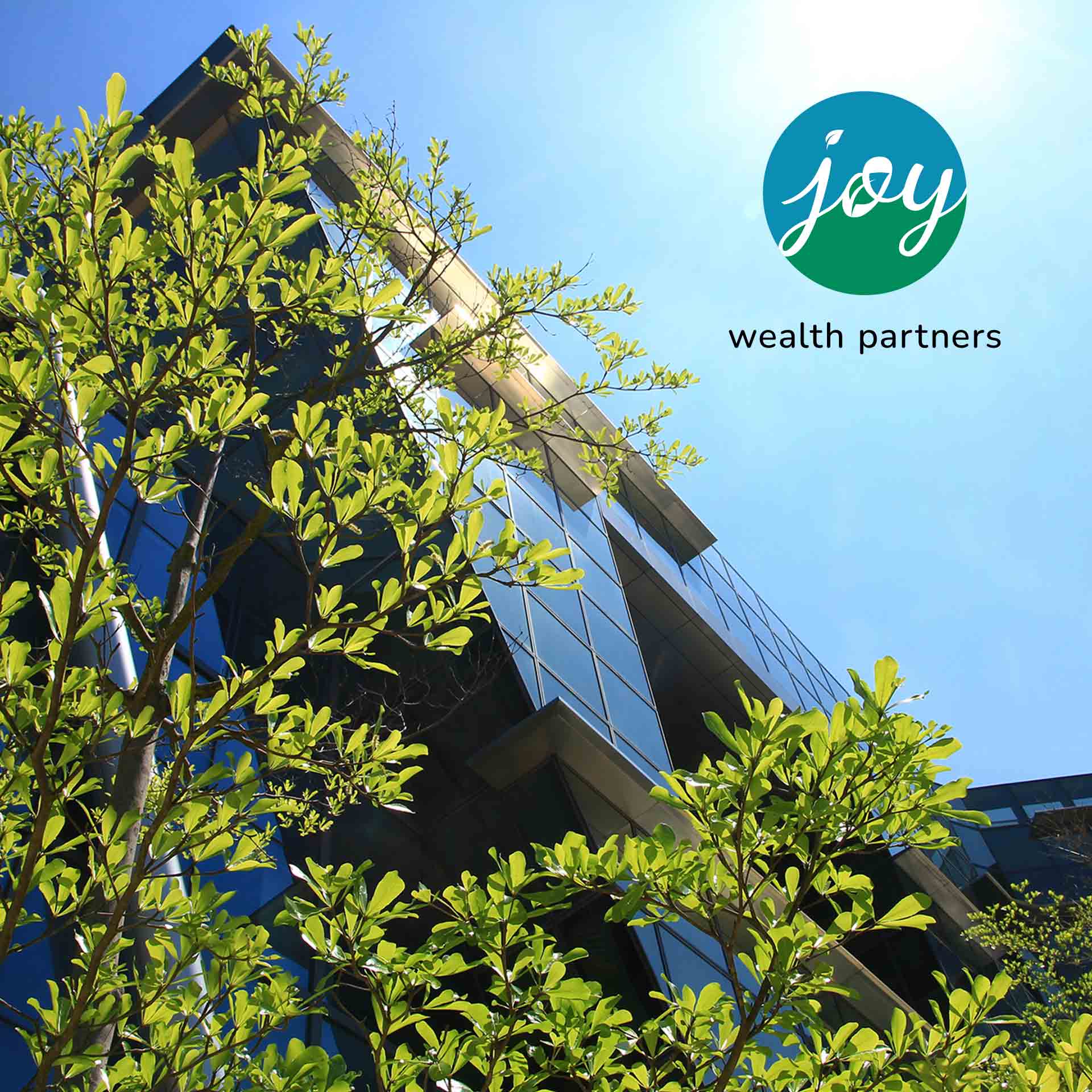
j.o.y. wealth partners – Typography
j.o.y. wealth partners – Final Thoughts

Final Thoughts

This identity system captures the heart of j.o.y. wealth partners: thoughtful, inclusive, and future-focused. The visual design is quiet yet intentional — supporting a brand that cares just as much about personal well-being as it does about financial growth.
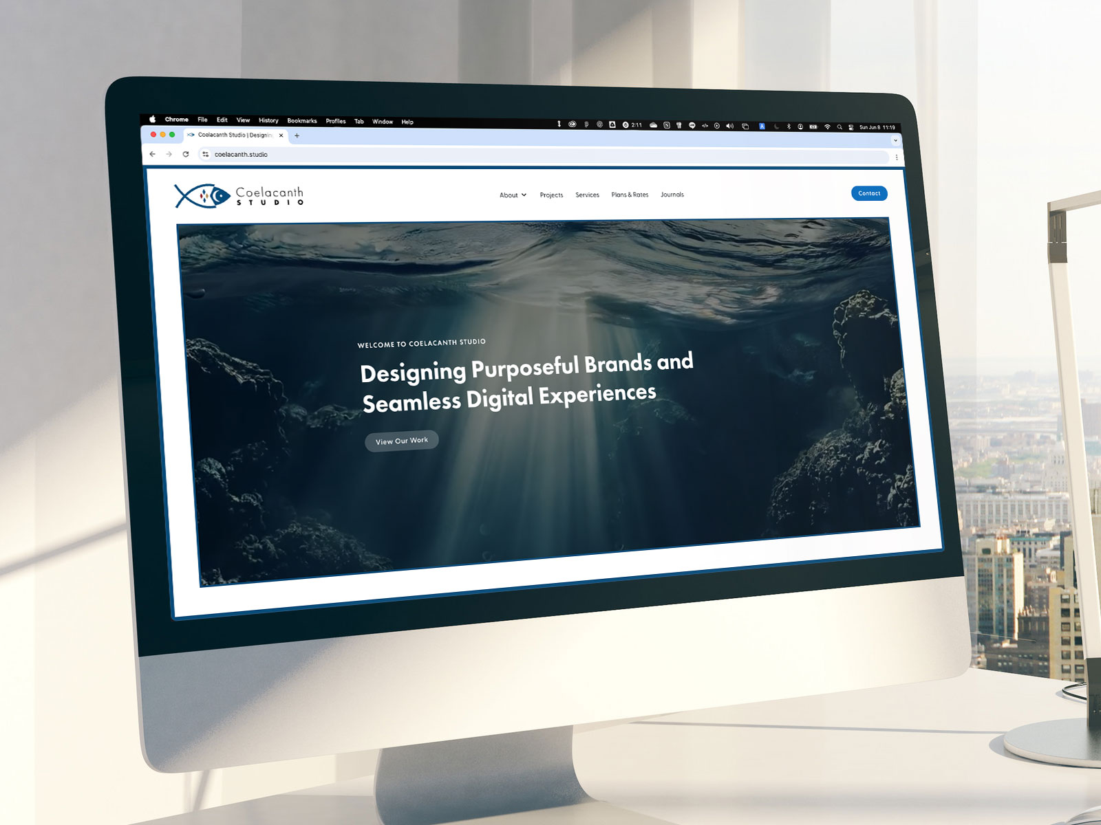
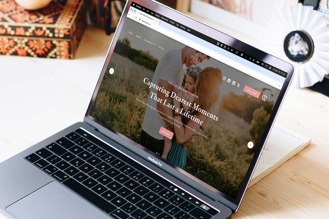
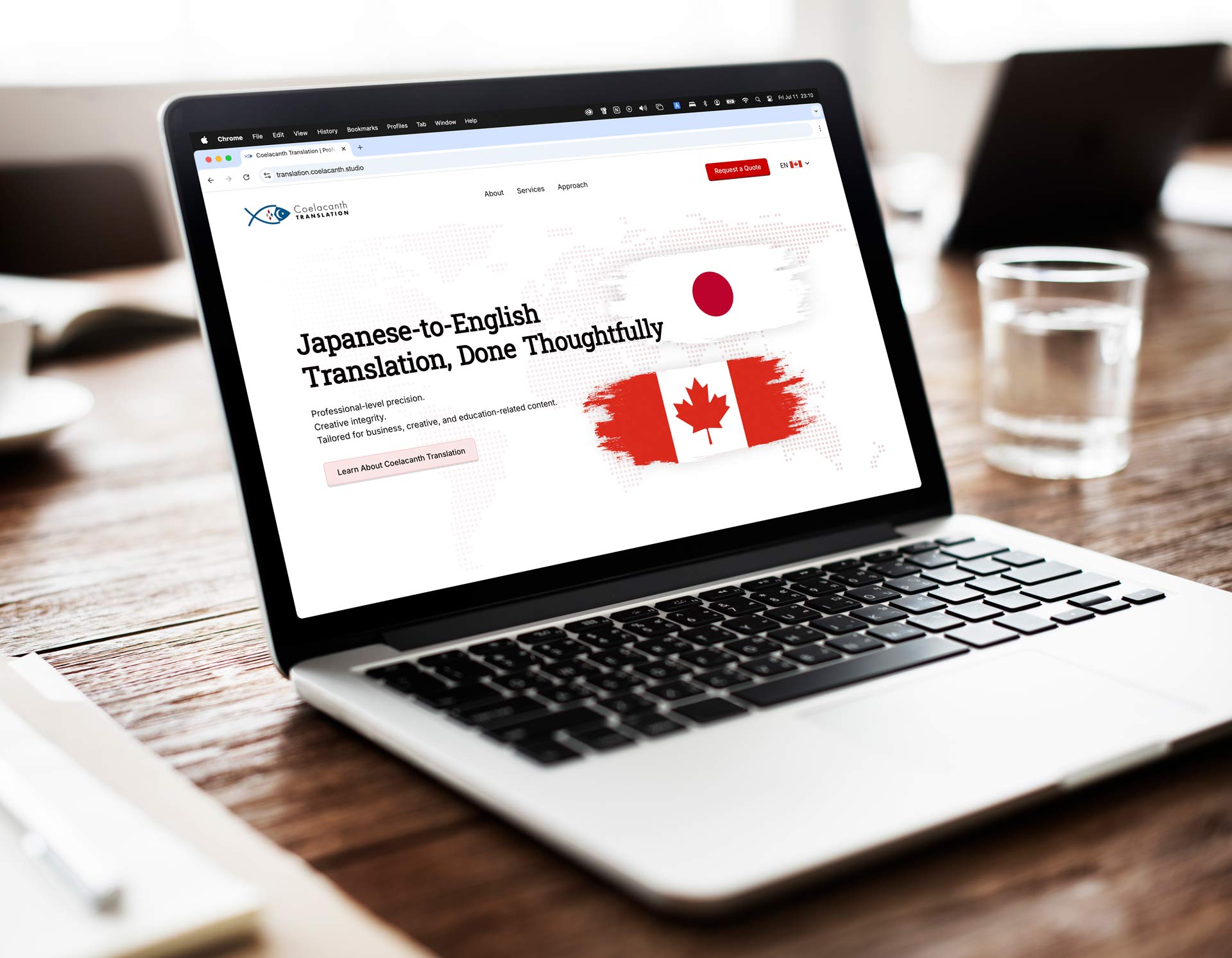
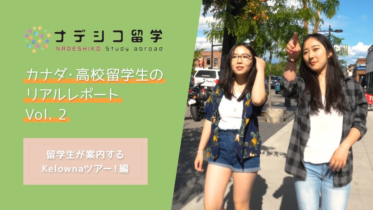
Get in Touch and Let’s Collaborate

Feel free to send me a message on LinkedIn using the link below — I’d love to hear from you.

“Ray built my brand from the ground up and brought it to life through a beautifully designed, fully functional website. His attention to detail and creativity are unmatched.”
Mary Ann Pre-Lecitona