Ray The Designer
Portfolio Showcase

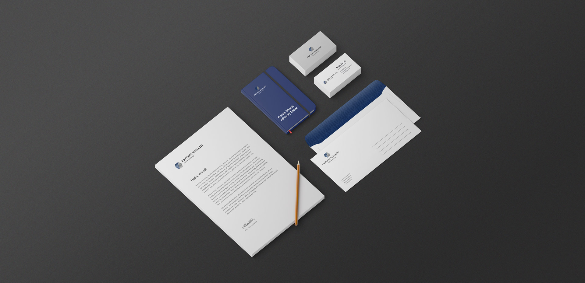
Private Wealth Advisory Group

Brand Identity Design Portfolio: Private Wealth Advisory Group
A balanced, professional logo designed to reflect the trusted relationship between client and advisor.
Industry:
Financial Services
Approved on:
February  2021
Contribution:
Brand Identity Design

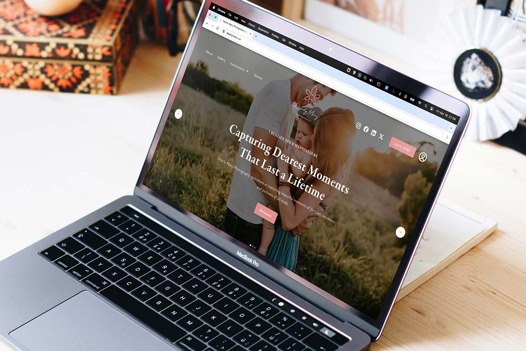
Dearly Mary Photography

Crafted a cohesive brand identity and custom Webflow website for a lifestyle photographer, showcasing her authentic, storytelling photography style and helping her connect with her ideal clients.
Branding
Website Design
Low-Code Development
Membership on Website

Industry

Photography

Release Date

April 2025

Contribution

Branding, Website Design, Low-Code Development, Membership on Website

Website

dearlymary.ca

Dearly Mary Photography

Crafted a cohesive brand identity and custom Webflow website for a lifestyle photographer, showcasing her authentic, storytelling photography style and helping her connect with her ideal clients.
Industry:
Photography
Release Date:
July 2025
Website:
dearlymary.ca

Project Overview

For Private Wealth Advisory Group, the objective was to develop a clean, structured identity that reflects the firm’s focus on building trusted financial relationships. The new logo system needed to feel intelligent, dependable, and human — mirroring the advisor-client dynamic that defines their personalized approach.

Concept & Design Direction

The logo centres on a majestic tree, symbolizing Safe Estate’s three decades of stable growth and legacy building. The visual language draws from nature and heritage, expressing financial maturity while keeping the tone accessible and confident.

The Urbanist typeface was selected to complement the organic form of the tree with modern clarity and professionalism. A deep green palette was chosen to evoke prosperity and trust — qualities that resonate with the target clientele.

Concept & Design Direction

The logo icon uses interlocking navy and grey forms to represent the two-way relationship between advisor and client — each side holding equal visual weight. It conveys balance, clarity, and mutual respect, making the symbol both visually stable and conceptually meaningful.

The wordmark uses Abhaya Libre, a contemporary serif with stately proportions and excellent legibility. “Private” and “Wealth” are emphasized in uppercase and bold styling, helping establish authority and recognition, while the overall stacked format maintains an organized, professional tone.

Concept & Design Direction

The logo centres on a majestic tree, symbolizing Safe Estate’s three decades of stable growth and legacy building. The visual language draws from nature and heritage, expressing financial maturity while keeping the tone accessible and confident.

The Urbanist typeface was selected to complement the organic form of the tree with modern clarity and professionalism. A deep green palette was chosen to evoke prosperity and trust — qualities that resonate with the target clientele.

Concept & Design Direction

The logo centers on a majestic tree, symbolizing Safe Estate’s three decades of stable growth and legacy building. The visual language draws from nature and heritage, expressing financial maturity while keeping the tone accessible and confident.

The Urbanist typeface was selected to complement the organic form of the tree with modern clarity and professionalism. A deep green palette was chosen to evoke prosperity and trust —qualities that resonate with the target clientele.

Primary Logo Lockup

This primary logo arrangement places the symbol above the stacked wordmark, creating a clean and centred layout ideal for formal brand uses.

Alternative Logo Lockup

The horizontal lockup arranges the icon and wordmark side by side, offering a compact and versatile format ideal for website headers, email signatures, and other narrow spaces where vertical stacking isn’t optimal.

Private Wealth Advisory Group – Colour Palette

Colour Palette

The navy tone conveys stability, integrity, and experience — key traits for a financial advisory firm. The grey adds neutrality and balance, while white supports visual clarity across all brand applications.

Typography

Abhaya Libre brings classic structure and trustworthiness to the brand, while Roboto offers clean readability for digital and printed content. Together, they ensure a cohesive voice that balances legacy and modernity.

Private Wealth Advisory Group – Typography
Private Wealth Advisory Group – Final Thoughts

Final Thoughts

This brand identity was designed to communicate trust, structure, and human connection — core values at the heart of Private Wealth Advisory Group. The resulting logo system is bold, professional, and versatile, ready to support the firm’s reputation for thoughtful financial guidance.

Get in Touch and Let’s Collaborate

Feel free to send me a message on LinkedIn using the link below — I’d love to hear from you.

“Ray built my brand from the ground up and brought it to life through a beautifully designed, fully functional website. His attention to detail and creativity are unmatched.”
Mary Ann Pre-Lecitona