Ray The Designer
Portfolio Showcase

Financial Staples

Brand Identity Design Portfolio: Financial Staples
A fresh, inclusive brand identity built to serve high-earning professionals with clarity, confidence, and care.
Industry:
Financial Services
Approved on:
May 2023
Contribution:
Brand Identity Design

Dearly Mary Photography

Crafted a cohesive brand identity and custom Webflow website for a lifestyle photographer, showcasing her authentic, storytelling photography style and helping her connect with her ideal clients.
Branding
Website Design
Low-Code Development
Membership on Website

Industry

Photography

Release Date

April 2025

Contribution

Branding, Website Design, Low-Code Development, Membership on Website

Website

dearlymary.ca

Dearly Mary Photography

Crafted a cohesive brand identity and custom Webflow website for a lifestyle photographer, showcasing her authentic, storytelling photography style and helping her connect with her ideal clients.
Industry:
Photography
Release Date:
July 2025
Website:
dearlymary.ca

Project Overview

Financial Staples exists to help women, people of colour, LGBTQ+ individuals, and other underrepresented professionals navigate financial planning with confidence. The rebrand was an opportunity to create a more intentional identity — one that moves away from generic symbols and instead reflects the duality of the firm’s personality: warm and approachable, yet modern and high-performing. The final design aims to feel both personal and professional — capable of resonating with clients from diverse backgrounds and competitive fields.

Concept & Design Direction

The logo centres on a majestic tree, symbolizing Safe Estate’s three decades of stable growth and legacy building. The visual language draws from nature and heritage, expressing financial maturity while keeping the tone accessible and confident.

The Urbanist typeface was selected to complement the organic form of the tree with modern clarity and professionalism. A deep green palette was chosen to evoke prosperity and trust — qualities that resonate with the target clientele.

Concept & Design Direction

The logo combines the letter “F” and a staple-like form to create a distinctive mark that’s both minimal and meaningful. Together, they subtly form the initials “FS” in the negative space — reinforcing the brand name while symbolizing connection, reliability, and structure. It’s a modern monogram that visually reflects the firm’s role as a foundational guide in their clients’ financial lives.

The logotype is set in Montserrat, a clean and confident sans serif. Its geometric clarity balances the soft, inclusive tone of the icon with a professional edge — making the brand feel established without being traditional or rigid.

Concept & Design Direction

The logo centres on a majestic tree, symbolizing Safe Estate’s three decades of stable growth and legacy building. The visual language draws from nature and heritage, expressing financial maturity while keeping the tone accessible and confident.

The Urbanist typeface was selected to complement the organic form of the tree with modern clarity and professionalism. A deep green palette was chosen to evoke prosperity and trust — qualities that resonate with the target clientele.

Concept & Design Direction

The logo centers on a majestic tree, symbolizing Safe Estate’s three decades of stable growth and legacy building. The visual language draws from nature and heritage, expressing financial maturity while keeping the tone accessible and confident.

The Urbanist typeface was selected to complement the organic form of the tree with modern clarity and professionalism. A deep green palette was chosen to evoke prosperity and trust —qualities that resonate with the target clientele.

Primary Logo Lockup

This is the default logo configuration, used across primary brand materials. The horizontal alignment supports clarity and balance across both digital and print applications.

Alternative Logo Lockup

This vertical lockup is ideal for stacked formats and smaller spaces, preserving brand recognition while maintaining flexibility in layout.

Financial Staples – Colour Palette

Colour Palette

The palette blends professionalism with approachability. Brighter tones of blue and green reflect growth, inclusivity, and optimism, while the deeper tones provide contrast and stability — creating a visual system that is confident, fresh, and human-centred.

Typography

Montserrat offers structure and presence, while Karla brings warmth and readability to supporting content. The type pairing reinforces a brand personality that is both approachable and high-caliber — fitting for a firm that serves thoughtful, high-performing professionals with care.

Financial Staples – Typography
Financial Staples – Final Thoughts

Final Thoughts

This identity repositions Financial Staples with clarity and intentionality. Moving away from generic industry tropes, the visual system reflects the founder’s mission: to build wealth with those who are often overlooked by traditional financial services. The result is a brand that feels confident, inclusive, and ready to grow with its community.
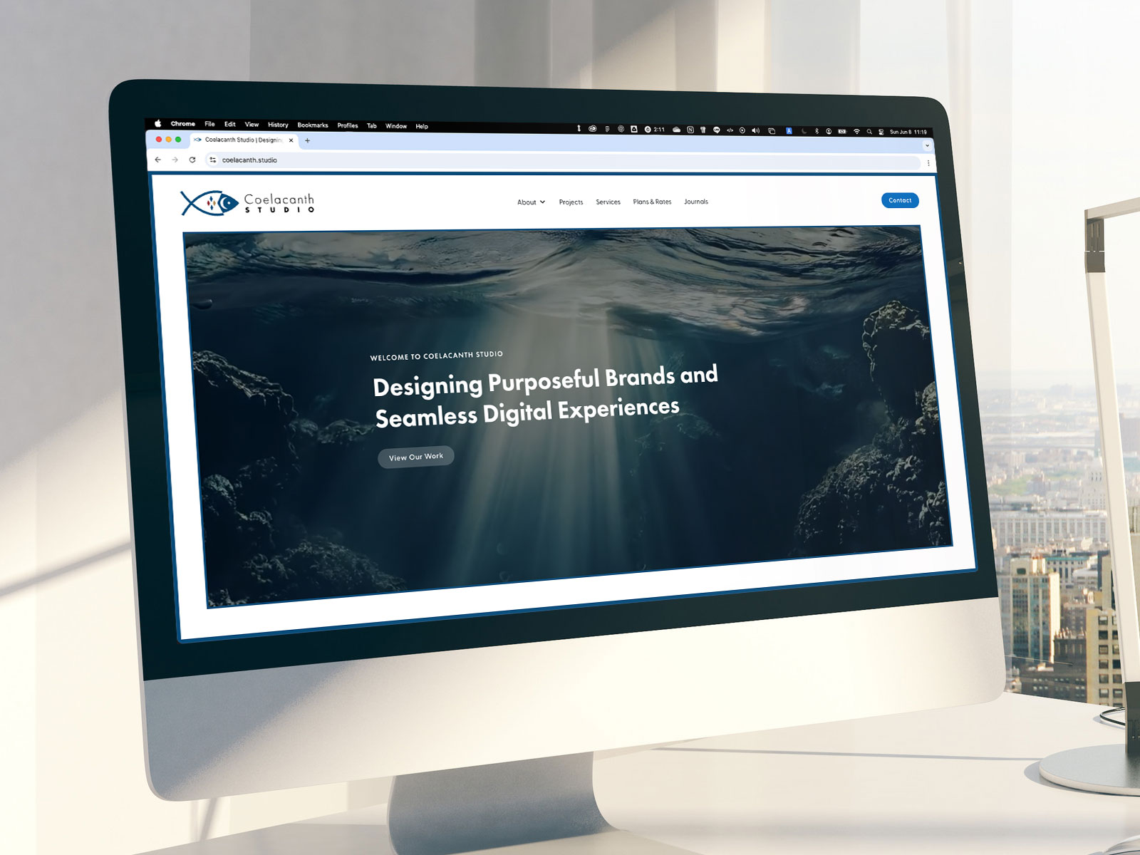
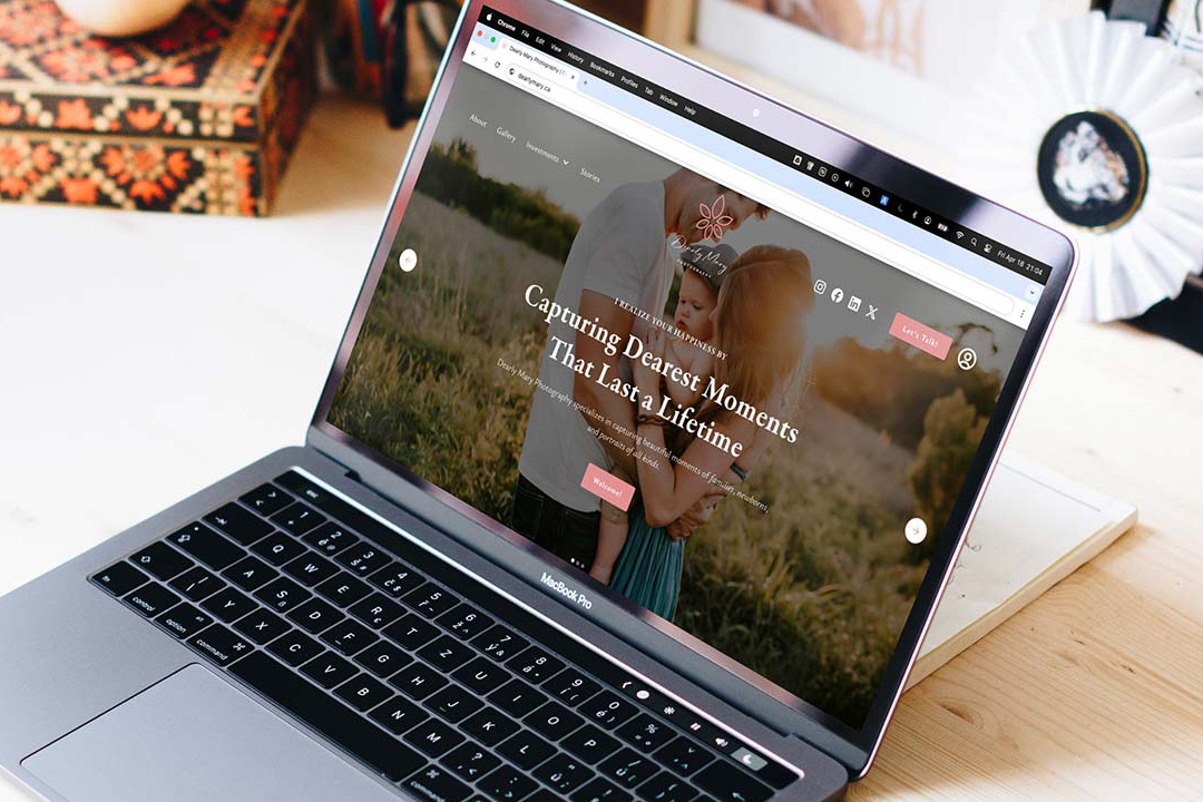
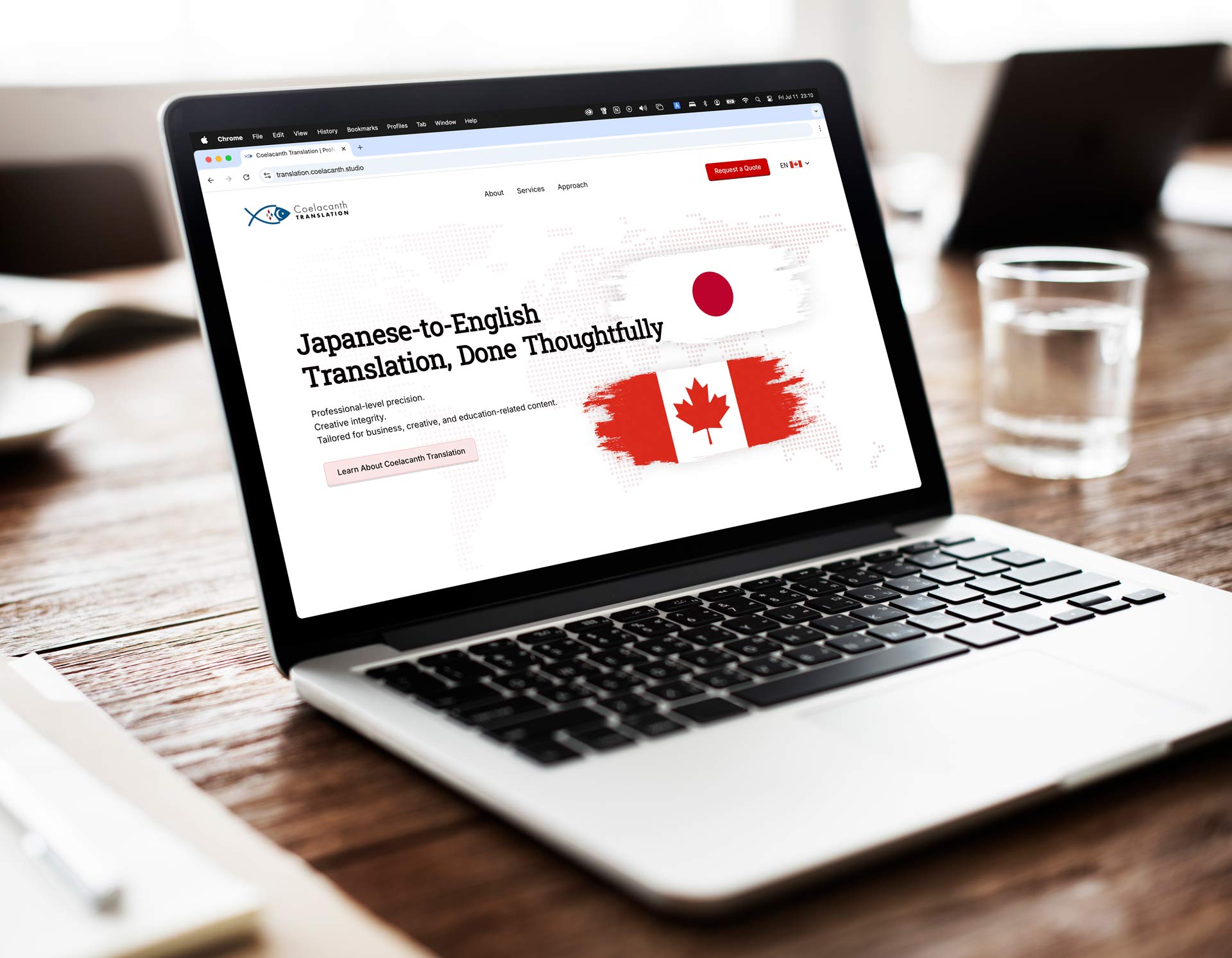
Get in Touch and Let’s Collaborate

Feel free to send me a message on LinkedIn using the link below — I’d love to hear from you.

“Ray built my brand from the ground up and brought it to life through a beautifully designed, fully functional website. His attention to detail and creativity are unmatched.”
Mary Ann Pre-Lecitona