Nova Wealth


Project Overview
Nova Wealth helps individuals approaching retirement build stable, predictable income plans. The goal of this project was to create a logo system that reflects the firm’s reliability, clarity, and commitment to long-term client relationships. The identity needed to balance strength and warmth — appealing to a demographic focused on security, legacy, and trust.
Concept & Design Direction
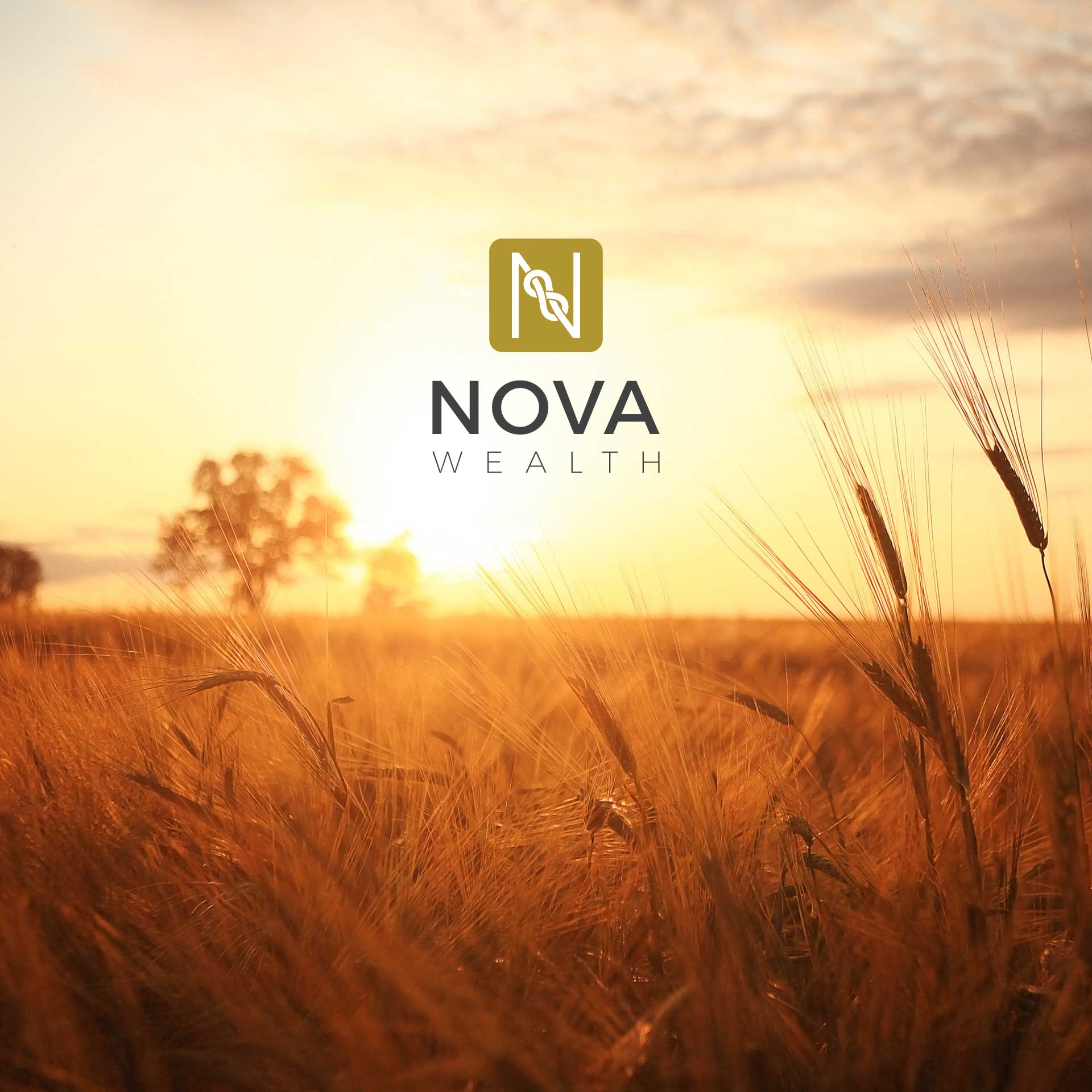
At the heart of the logo is a gold square containing an “N” symbol that subtly forms a knot — representing the trusted connection between Nova Wealth and its clients. This visual metaphor reflects the firm’s promise of dependable, personalized financial guidance.
The wordmark, set in uppercase Alexandria, communicates strength, professionalism, and polish. The classic serif forms elevate the brand’s sense of credibility while keeping it visually distinctive and timeless.

Primary Logo Lockup
The primary logo pairs the knot-inspired “N” icon with the full wordmark in a vertical arrangement, ideal for formal brand use across print and digital platforms.
Alternative Logo Lockup
This version repositions the elements into a horizontal format — maintaining clarity and recognition when vertical space is limited.

Colour Palette
Gold symbolizes wealth, success, and long-term value, while neutral grays and whites provide balance, sophistication, and legibility across media.
Typography
This type pairing reinforces the brand’s tone: authoritative yet human. Alexandria delivers formality and elegance, while Poppins ensures accessibility and clarity in supporting content.

Logo Applications
Final Thoughts
Nova Wealth’s identity system was designed to resonate with individuals preparing for the next chapter in life. Through thoughtful symbolism, premium typography, and a timeless colour palette, the brand conveys reliability, care, and long-term vision.
Featured Portfolio
Discover thoughtfully crafted work, each designed to elevate its brand to its fullest potential.